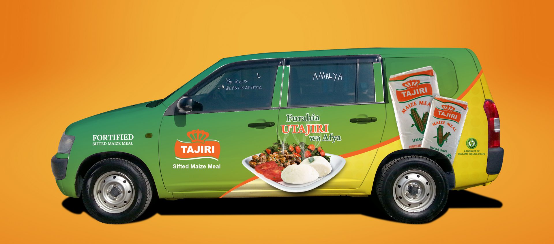
Vehicle branding or lettering is crucial for up and coming brands or companies who want to use advertisement as an extensive weapon to reach out to the masses. Vehicles are one of the best modes of advertisement as they can move around the place delivering the message to relatively more people in an interesting way. But, before wrapping your vehicles in vibrant colors and enormous fonts, keep in mind these do’s and don’ts.
Simplicity is Key
Since a vehicle is mobile, congesting the advertisement with excessive information is not advisable. Instead, keeping it basic helps people to notice and also read the content explaining the brand. Too much graphics should be avoided and the necessary graphics should be displayed explaining the brand’s advertisement aim.
The Bolder the Better
The boldness and simplicity of the font are crucial. Something which can be seen from a distance is highly acknowledged. Flashy and flowery fonts are not welcome as they can be a distraction, undermining the main aim of the advertisement.
Make Use of All the Sides
A vehicle has four sides, out of which three can be used extensively for branding. Using only one side is wastage of space and critical information is missed out due to the lack of space. Usage of four sides allows a lot of information, pictures, and graphics to be printed, providing more information.
Professionalism is Key
Using unwanted and impractical images can be distracting and people are not very fond of it. Instead, using relatable pictures or images and something which is basic yet professional is highly welcomed by people, thus, attracting more crowd. Using professional images reflects the taste and quality of the brand.
Do Not Confuse the Public
Whatever the font is, whatever the image is everything works if the message is right and conveyed perfectly. For a brand to grow, attracting, and satisfying the customer is key. The basic is to attract the customer that can be done by advertisement.
Leave a Mark
An advertisement should be of such an order that it makes a statement and leaves a profound mark on the minds of the consumer. Billboards, posters are something that people see once and mostly forget. But vehicle branding moves around the place, creating a statement in the customer’s mind.
JF Litho signs create the best-in-class vehicle branding signs that make an impact on the consumer world while helping a brand to grow successfully.


Comments